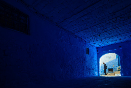
During the drab and depressing days of lockdown, Instagram’s sun seeking algorithm has fed us colourful architecture as an aspirational escape from our bedrooms and empty grey streets – from the carefully curated courtyards of Luis Barragán to the saturated azure of Chefchaouen. Although we might have become used to seeing buildings through the 1080-pixel square of our Instagram feeds, social media’s presentation of colourful architecture actually reflects a real-life aesthetic revival in building design that is bringing colour to a street near you.
At the forefront of the colour renaissance are UK-based architecture studio Office S&M, founded by Catrina Stewart and Hugh McEwen. The practice has been named as part of a new stylistic movement termed Multiform by critic Owen Hopkins. He identifies the style by its bold use of colour and layered forms, describing it as meeting ‘the complexity of the contemporary world with ideological diversity and aesthetic pluralism.’ A style for the fourth industrial revolution – blurring our digital and physical worlds to make one present in the other.
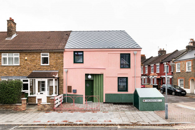
In 2017 Office S&M captured the aesthetic zeitgeist in their unfaltering use of the internet’s heartthrob – ‘Millennial Pink’ – for the exterior of Salmen House (the hue went on to be named Pantone’s colour of 2018). ‘We don’t produce quiet architecture’, said Hugh, ‘and this house revels in colour and materiality, which makes it a representation of the contemporary age in which it has been built.’
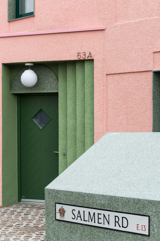
The textured pink exterior walls are complemented by grey roof tiles and deep green terrazzo window reveals that give richness to the façade without overpowering one another. The practice looked at the site’s light quality, rather than neighbouring colour context, to select the palette. They did rigorous testing of colour combinations to see how shades differed under changing light conditions and worked closely with manufacturers to refine samples to ensure that the shades they were planning for would match in reality at the scale of the building. Office S&M do also celebrate the fact that colours are always in flux, shifting shades throughout the day – ‘that’s also what’s so joyous, that colours do change, day-in, day-out, and I don’t think that should be suppressed.’
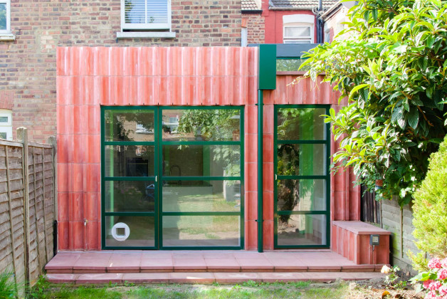
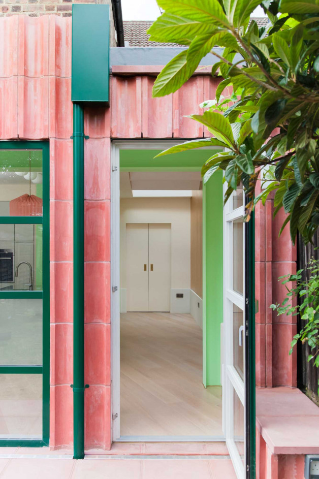
Capturing the interplay of colour and light is key to Overcast House, an extension for a Victorian house in north London completed in 2020 and nominated for this year’s NLA Don’t Move Improve awards. The project’s name is a reference to the pigmented cast concrete of the façade, whose undulating forms act as ‘shadow catchers’ and help bring indirect light into the space. The owner of the house is a colour consultant, and it was essential for the project to create even light conditions so that colour consistency was maintained when she met her clients.
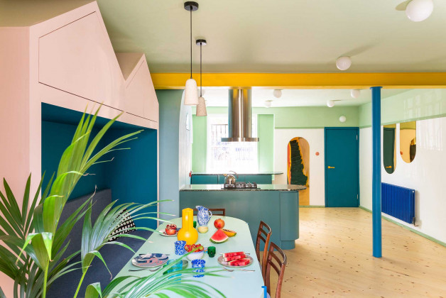
The interrelation of materials and their colour integrity is highlighted by Office S&M – ‘We always try and use self-coloured materials, because there’s something interesting about the material texture also being linked to the colour of the material. If a colour is an intrinsic part of the material you can’t disassociate the two.’ This is realised in the layers of stories of the reclaimed materials of Mo-tel House – a 2020 remodelling of the ground floor of a Victorian townhouse in Islington, London, for a young family. Office S&M chose materials that have been borrowed, reused and reframed for their new purpose in the house, including old milk bottles and chopping boards melted down to make a shining marbled worktop in the bathroom, green terrazzo in the kitchen made from waste marble chips, and the light pendants made from recycled brick grog.
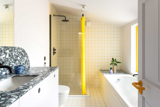
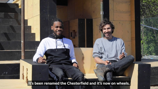
The house is a puzzle of plinths, cosy corners and crawlable spaces – with all the furniture designed by the architects to create wonder at the different scales of the house’s inhabitants. Alongside tinted mirrors, tropical colours were used throughout to reflect and frame views, distorting the scale of the building. Office S&M have mastered using colour as a material in itself, to shape space without relying solely on form. We know that colour has the power to create space and depth in two dimensions from looking at popular paintings – like those by the Impressionists who used colour contrasts and complements to achieve depth, rather than line to create perspective. This same principle is used by Office S&M in their projects, in the vibrant colours of Mo-tel House and in Salmen House and Overcast House where the pink and green pairings contrast and help to visually enlarge the spaces – ‘with Salmen House we used complementary colours to make the house feel bigger and more generous on the street. And those ways of using colour where it becomes spatial are very exciting for us.’ The practice works to the mantra of ‘treating colour with the same gravitas that you might treat form.’
Does the budding popularity of their work mark an end to the white cube’s reign as the de facto ‘neutral’ space? The practice hope that soon colour will become more widely embraced and architects won’t have to justify its use in every plan – ‘it’s such a simple, cheap material which can be temporary, and yet people are so afraid of it!’ But perhaps after a year of sitting indoors in our personal white cubes, people will be a bit less afraid of inspiring joy through colour.
Find out more about Office S&M and their work on their website here.